What is a yield curve, and more importantly, why are stock investors interested in its shape?
A yield curve gives a snapshot of how yields vary across bonds of similar credit quality, but different maturities, at a specific point in time. For example, the US Treasury yield curve indicates the yields of US Treasury bonds across a range of maturities. Bond yields change as markets digest news and events around the world, which also causes yield curves to move and change shape over time.
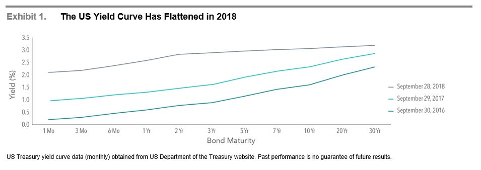
Exhibit 1 includes snapshots of the US Treasury yield curve on the last trading day of September for the last three years. Rates across the entire curve have generally moved higher since 2016. However, short-term rates moved at a faster pace than long-term rates leading to a “flattening” of the slope of the yield curve.
Historically, yield curves have mostly been upwardly sloping (short-term rates lower than long-term rates), but there have also been several periods when the yield curve has either been flat or inverted. One question often posed by investors is whether inverted yield curves predict a future stock market decline. While the handful of instances of curve inversions in the US may concern investors, the small number of examples makes it difficult to determine a strong connection, and evidence from around the world suggests investors should not extrapolate from the US experience.
The US Market
Exhibit 2 illustrates growth of a hypothetical $1,000 investment in the S&P 500 Index since June 1976 plotted against the difference between 10-year and 2-year Treasury yields. This difference is referred to as the term spread and is a commonly used measure of yield curve steepness. Also marked on the chart are the onset of the four periods when the yield curve inverted for at least two consecutive months, and short-term rates began to exceed long-term rates.
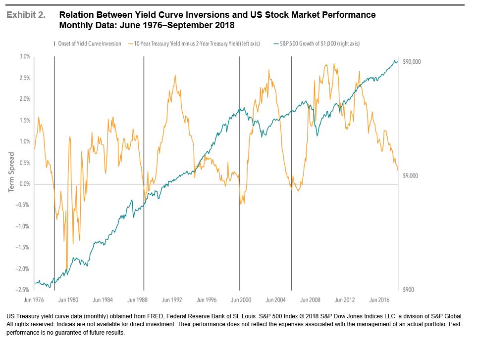
The inversion prior to the 2008 financial crisis is interesting to review. The US yield curve inverted in February 2006, after which the S&P 500 Index posted a positive 12-month return. The yield curve’s slope became positive again in June 2007, well prior to the market’s major downturn from October 2007 through February 2009. If an investor had interpreted the inversion as a sign of an imminent market decline, being out of stocks during the inverted period could have resulted in missing out on stock market gains. And if the same investor bought additional stock once the curve’s slope became positive, they would also have been exposed to the stock market weakness that followed.
Increasing the Sample
The small number of US yield curve inversions over the last 40 years makes it challenging to draw strong conclusions about the effect on stock market performance. We can, however, look at other countries to gain a better sense of the relation between inversions and subsequent market returns. Exhibit 3 shows the hypothetical growth of $1,000 of the country’s local currency invested in the local stock market index the month before yield curve inversions began in five major developed nations, including the US, since 1985.

In 10 out of 14 cases of inversion, local investors would have had positive returns investing in their home markets after 36 months. This is not much less than the historical experience of these markets over the same time frame, regardless of the shape of the yield curve. These results show that it is difficult to predict the timing and direction of equity market moves following a yield curve inversion.
Though the data set is limited, an analysis of yield curve inversions in five major developed countries shows that an inversion may not be a reliable indicator of stock market downturns.
Source: Dimensional Fund Advisors
What’s a Flattening Yield Curve?
What is a yield curve, and more importantly, why are stock investors interested in its shape?
A yield curve gives a snapshot of how yields vary across bonds of similar credit quality, but different maturities, at a specific point in time. For example, the US Treasury yield curve indicates the yields of US Treasury bonds across a range of maturities. Bond yields change as markets digest news and events around the world, which also causes yield curves to move and change shape over time.
Exhibit 1 includes snapshots of the US Treasury yield curve on the last trading day of September for the last three years. Rates across the entire curve have generally moved higher since 2016. However, short-term rates moved at a faster pace than long-term rates leading to a “flattening” of the slope of the yield curve.
Historically, yield curves have mostly been upwardly sloping (short-term rates lower than long-term rates), but there have also been several periods when the yield curve has either been flat or inverted. One question often posed by investors is whether inverted yield curves predict a future stock market decline. While the handful of instances of curve inversions in the US may concern investors, the small number of examples makes it difficult to determine a strong connection, and evidence from around the world suggests investors should not extrapolate from the US experience.
The US Market
Exhibit 2 illustrates growth of a hypothetical $1,000 investment in the S&P 500 Index since June 1976 plotted against the difference between 10-year and 2-year Treasury yields. This difference is referred to as the term spread and is a commonly used measure of yield curve steepness. Also marked on the chart are the onset of the four periods when the yield curve inverted for at least two consecutive months, and short-term rates began to exceed long-term rates.
The inversion prior to the 2008 financial crisis is interesting to review. The US yield curve inverted in February 2006, after which the S&P 500 Index posted a positive 12-month return. The yield curve’s slope became positive again in June 2007, well prior to the market’s major downturn from October 2007 through February 2009. If an investor had interpreted the inversion as a sign of an imminent market decline, being out of stocks during the inverted period could have resulted in missing out on stock market gains. And if the same investor bought additional stock once the curve’s slope became positive, they would also have been exposed to the stock market weakness that followed.
Increasing the Sample
The small number of US yield curve inversions over the last 40 years makes it challenging to draw strong conclusions about the effect on stock market performance. We can, however, look at other countries to gain a better sense of the relation between inversions and subsequent market returns. Exhibit 3 shows the hypothetical growth of $1,000 of the country’s local currency invested in the local stock market index the month before yield curve inversions began in five major developed nations, including the US, since 1985.
In 10 out of 14 cases of inversion, local investors would have had positive returns investing in their home markets after 36 months. This is not much less than the historical experience of these markets over the same time frame, regardless of the shape of the yield curve. These results show that it is difficult to predict the timing and direction of equity market moves following a yield curve inversion.
Though the data set is limited, an analysis of yield curve inversions in five major developed countries shows that an inversion may not be a reliable indicator of stock market downturns.
Source: Dimensional Fund Advisors
Recent Posts
Bond Markets Are Quietly Pulling Their Weight in 2025
Your 2025 Year End Tax Planning Checklist
Monthly Market Update: Markets Digest the Path of Interest Rates & the Next Phase of the AI Cycle
Subscribe to Our Blog
Shareholder | Chief Investment Officer